
ALUME Journal • Small Apartment Guide
Most small apartments don't look cheap because of the budget. They look cheap because of five specific mistakes that are easy to make and just as easy to fix.
Disclosure: This page contains affiliate links. Alume may earn a small commission at no extra cost to you. Recommendations are selected for the edit, not the commission.
Why "Cheap" Is a Design Problem, Not a Budget Problem
The most expensive apartment can look cheap if it makes the wrong decisions. The most modest apartment can look considered and intentional if it makes the right ones. The difference is never the price tag on the furniture — it's the five decisions below.
Each mistake on this list is something that reads as cheap to the eye immediately — before anyone consciously processes what they're looking at. And each one has a specific, affordable fix that reverses the signal entirely.
The Overhead Light Is On
THE MOST EXPENSIVE-LOOKING MISTAKE
Nothing makes an apartment look cheaper faster than overhead lighting. It flattens the room, eliminates shadow, washes out warm tones, and makes even expensive furniture look flat and lifeless. Every hospitality designer, every interior photographer, and every set decorator knows this — which is why you never see overhead lighting in a magazine room, a hotel lobby, or a film set.
The fix is not expensive. It's a switch. Turn the overhead off and add a warm arc floor lamp at sofa height. The room will look more expensive within sixty seconds of the overhead going off — before you've moved a single piece of furniture or bought anything new.


The Rug Is Too Small
THE SCALE MISTAKE
A rug that's too small for the furniture arrangement is one of the most reliable signals that a room wasn't designed. It creates an island of warmth surrounded by bare floor that looks accidental rather than intentional — like the rug arrived first and the furniture was placed around it without considering the relationship between the two.
The rule is specific: in a living room, the rug needs to be large enough that all front legs of the main seating pieces sit on it simultaneously. In a bedroom, it should extend at least 18 inches beyond each side of the bed. A 5×7 rug under a full sofa arrangement looks like a bath mat. An 8×10 rug under the same arrangement looks like a designed room.


Everything Is the Same Texture
THE FLATNESS MISTAKE
A room with no textural variation reads as flat — and flat reads as cheap. When the sofa, the pillows, the curtains, and the rug are all smooth or all the same material weight, the eye has nothing to move between. The room feels one-dimensional even if the individual pieces are high quality.
Textural contrast is what makes a warm neutral room feel rich rather than beige. The formula is simple: pair one rough texture with one soft texture in every zone. Seagrass rug with a chunky knit throw. Linen pillow covers with a bouclé chair. Woven basket with a smooth ceramic vase. The contrast between materials is what creates the sense of depth that makes a room feel expensive.


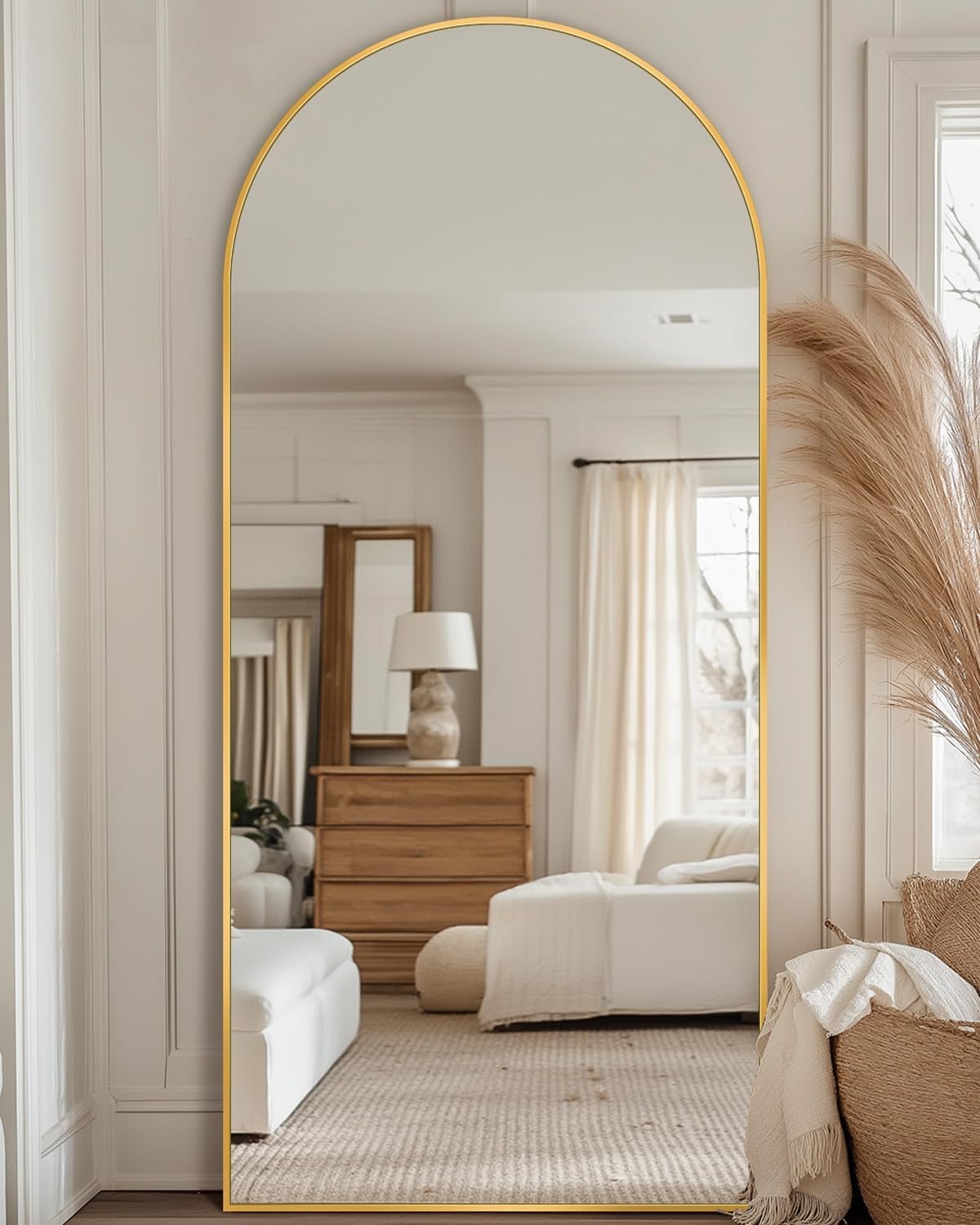
No Vertical Element
THE HEIGHT MISTAKE
A room where everything sits at the same height reads as unfinished. Sofas, coffee tables, consoles — most furniture lives between 18 and 36 inches off the floor. When nothing breaks above that plane, the eye has no reason to travel upward and the ceiling feels lower than it is. The room reads as flat and cramped regardless of its actual dimensions.
One tall element fixes this entirely. A faux olive tree in a woven basket in the corner. A floor lamp that arcs above sofa height. A tall mirror leaning against the wall. Any of these draws the eye upward, makes the ceiling feel higher, and adds the vertical dimension that distinguishes a designed room from a furnished one.

Too Many Colors, Not Enough Commitment
THE PALETTE MISTAKE
A room with too many competing colors reads as unresolved — and unresolved reads as cheap. Not because the individual pieces are low quality, but because the eye can't find a through line. When the sofa is grey, the rug is patterned, the pillows are three different colors, and the accessories are in finishes that don't relate to anything else, the room looks like it was assembled from multiple apartments rather than designed as one.
Committing to one palette — warm neutrals: cream, ivory, honey, oatmeal, sage, natural linen — and running it through every layer of the room creates the sense of completeness that makes a space feel designed. It is not boring. It is resolved. And resolved always reads as expensive.


Fix Them in This Order
Start with the lighting — turn the overhead off and add the arc lamp. That single change will do more for the room than any purchase you could make. Next, assess the rug size. If it's too small, size up before buying anything else — the rug sets the scale for everything above it. Then add textural contrast through pillows and a throw. Add a tall vertical element. Finally, edit the palette — remove anything that doesn't belong to the warm neutral family and look at what remains.
None of these fixes require a renovation, a large budget, or starting over. They require five specific decisions made in the right order. A room that looks cheap almost always does so for one or more of these five reasons — and fixing any one of them makes an immediate, visible difference.
Related Guide
Once the mistakes are fixed, the magazine-worthy guide covers the seven decisions that take a small apartment from fixed to genuinely designed.
The Secret to a Small Apartment That Looks Magazine-Worthy →Next in Journal
Some links in this page may be affiliate links — Alume may earn a small commission at no extra cost to you. Recommendations are selected for the edit, not the commission.