
ALUME Journal • Small Apartment Guide
Most small apartment color mistakes aren't about the colors chosen — they're about how they're combined, how many there are, and what the light does to them. Here's what's making your palette work against you.
Disclosure: This page contains affiliate links. Alume may earn a small commission at no extra cost to you. Recommendations are selected for the edit, not the commission.
Why Color Is Making Your Small Apartment Look Cheaper
The most common small apartment color mistake isn't bold color — it's beige done wrong. A room full of similar flat neutrals with no variation in tone, texture, or warmth reads as unfinished rather than minimal. The walls, the sofa, the rug, and the throw all end up in the same visual register and the room disappears into itself.
The fix is understanding that warm neutrals aren't one color — they're a family of colors that range from pale cream to deep honey to soft sage to matte white. The palette works when those tones layer against each other with texture doing the work of contrast. When every piece is the same flat tone and the same flat texture, the room looks cheap regardless of what the pieces cost.
The seven mistakes below are the most common ways people get warm neutrals wrong — and the specific fixes that make the palette work.
Everything Is the Same Tone
THE MOST COMMON MISTAKE
A cream sofa, cream walls, cream rug, cream throw — all the same pale tone — creates a room that looks washed out rather than warm. Warm neutrals need tonal range to read as designed. The palette should move from pale cream at the top (walls, curtains) through mid-warm at the furniture level (sofa, chair) to deep honey at the floor (rug, wood). Each level needs to be a slightly different temperature so the eye has somewhere to travel.
The fix: introduce one deeper tone. A honey-brown seagrass rug under cream furniture immediately separates the levels and makes the whole room feel more intentional.
No Texture Contrast
THE FLATNESS MISTAKE
In a warm neutral palette, texture does the work that color would do in other palettes. When every piece has the same smooth finish — microfiber sofa, flat rug, synthetic throw — the room looks flat regardless of the color. Texture creates visual contrast without introducing a new color. Coarse seagrass against smooth linen. Chunky knit against bouclé. Matte ceramic against woven rattan.
The palette needs at least four distinct textures working simultaneously: something coarse (the rug), something soft (the throw), something woven (a basket or tray), and something smooth (ceramic or wood). Without this texture stack, warm neutrals look institutional.
The Accent Color Is Too Strong
THE PROPORTION MISTAKE
Warm neutral palettes need one accent color — and that color needs to be muted enough to feel like it belongs rather than arrived from somewhere else. The most common mistake: using a saturated accent that competes with rather than completes the palette. A bright teal pillow on a cream sofa pulls the eye away from the room instead of settling it into the space.
The right accent for a warm neutral palette is soft sage green — muted, slightly grayed, warm-leaning. It adds visual interest without introducing a new temperature into the room. Two sage green linen pillows against a cream sectional is the exact proportion that works: small enough to be an accent, present enough to anchor the palette.
Cold White Instead of Warm White
THE TEMPERATURE MISTAKE
Not all whites are warm. A cool, blue-leaning white on walls or bedding reads as clinical under warm lamp light — which is exactly the light source a warm neutral room uses. The white in a warm neutral palette needs to lean cream, not blue. Warm white walls. Cream linen duvet. Ivory throw. The distinction between warm white and cool white is subtle in daylight and enormous under lamp light.
The fix is simple: choose bedding, curtains, and walls in warm white or natural linen tones rather than bright white. Natural linen duvet covers are the single fastest bedroom fix — they shift the entire room from clinical to cozy under warm light.
Overhead Lighting Killing the Palette
THE LIGHTING MISTAKE
Warm neutrals are highly sensitive to light temperature. Under cool overhead lighting, cream reads as dingy and the entire palette flattens. Under warm lamp light at lower heights, the same palette glows. The color hasn't changed — the light has. An arc floor lamp with a warm bulb over the sofa transforms warm neutrals from flat to rich in a way no amount of styling can replicate.
This is why warm neutral rooms in design photography always look warmer than they do in person — the photography uses warm directional lighting that the room itself may not have. Replicate that lighting with warm-bulb floor and table lamps and the palette performs the way it was always supposed to.
Too Many Colors Calling Themselves Neutral
THE COLLECTION MISTAKE
Greige, taupe, mushroom, sand, putty, linen, stone — these all sound neutral but they don't necessarily work together. Each one has a distinct undertone (pink, green, yellow, blue) and when you mix undertones the palette reads as muddy rather than layered. A taupe sofa (pink undertone) against a greige wall (green undertone) against a sand rug (yellow undertone) creates visual tension that no styling can resolve.
The fix: choose one undertone family and stay in it. Warm neutrals work because they all share a yellow-amber undertone. Cream, ivory, honey brown, natural linen, and soft sage are all warm-leaning and work together without fighting. Cold-leaning neutrals (greige, stone, cool gray) belong to a different palette entirely.
The Palette Stops at the Furniture
THE INCOMPLETE PALETTE MISTAKE
A warm neutral palette that only covers the sofa and rug but doesn't carry through to bedding, throw pillows, surface styling, and candles reads as partially designed. The palette needs to be present in every layer of the room — from the large furniture pieces down to the smallest decorative object on the coffee table. An amber glass candle, a natural rattan tray, a white ceramic vase — these small pieces complete the palette at the surface level and signal that the room was designed rather than furnished.
The palette is complete when you can look at any surface in the room and see the same warm neutral tones reflected back. When the styling objects feel separate from the furniture, the palette isn't finished yet.
Build the Palette — Shop the Pieces
Every piece below is a specific layer of the warm neutral palette — from the floor up to the smallest surface object.

Mistake 1 — Tonal Range
Safavieh Natural Fiber Seagrass Rug — 8×10
$248.80
The deep tone anchor of the warm neutral palette. Honey-brown against cream furniture is the tonal separation the palette needs — the rug does what paint can't by grounding the whole room in a warmer, deeper register than anything above it.

Mistake 1 — Mid Tone
Weture Modular Cloud Sectional — Cream
$339.99
The mid tone in the palette — warmer than the walls, lighter than the rug. Cream upholstery is the foundation the palette layers from. Under warm lamp light it reads rich rather than flat, which is exactly what warm neutrals need to perform.

Mistake 2 — Texture Layer
Chunky Knit Throw Blanket — Ivory
$42.49
The coarse texture layer that a warm neutral palette needs against smooth upholstery. Draped loosely over the sofa arm, it adds the tactile contrast that prevents the room from reading flat. Ivory tone stays in the warm family while the chunky knit creates enough visual weight to register as a distinct palette element.

Mistake 3 — Accent Color
MIULEE Textured Linen Pillow Covers — Sage
$26.99
Soft sage green — muted, warm-leaning, slightly grayed — is the one accent color that completes a warm neutral palette without competing with it. Two covers on the sofa is the right proportion: present enough to anchor the palette, restrained enough to stay secondary to the room's warm tones.

Mistake 4 — Warm White
Simple&Opulence Linen Duvet Cover — Natural
$159.99
Natural linen in warm oatmeal rather than cool bright white. Under warm lamp light this duvet cover transforms the bedroom from clinical to warm in a single swap. The washed linen texture also adds the tactile layer the bedroom palette needs — soft, slightly rumpled, and unmistakably warm in tone.

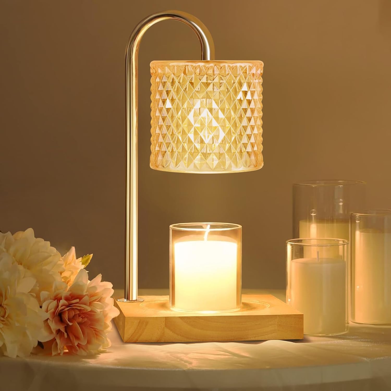
Mistake 5 — Warm Light
Brightech Sparq Arc Floor Lamp — Brass
$249.99
The light source that activates the warm neutral palette. Under warm amber glow from this arc lamp, cream reads rich, honey tones deepen, and the whole room performs the way warm neutrals are supposed to. Turn the overhead off — this lamp is the reason warm neutral rooms look the way they do in every interior photo you've saved.
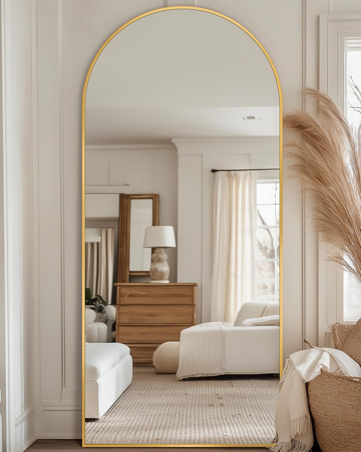
Mistake 5 — Light Amplifier
NeuType Arched Floor Mirror — Gold Frame, 65"
$35.98
A leaning mirror opposite the arc lamp doubles the warm light in the room and reflects the palette back into itself. The gold frame stays within the warm tonal family — never chrome, never black — and the reflected warmth makes the whole palette feel more cohesive than any piece of furniture could.

Mistake 7 — Surface Palette
Rattan Serving Tray with Handles — Natural
$39.99
The woven texture layer at the surface level — the palette's version of a coffee table tray. Natural rattan carries the warm neutral tones from the rug up to the tabletop, completing the tonal story at the smallest scale. Place a candle and a vase inside it and the surface is styled with three objects that read as one intentional arrangement.
Mistake 7 — Palette Completion
Amber Glass Scented Candle
$19.99
Amber glass carries the warm palette down to the smallest object on the surface. Lit, it adds a second light source at table level — the warm glow that completes the layered lighting approach. Unlit, the amber glass still reads as a warm tonal object that connects to the honey tones throughout the room. The smallest piece with some of the highest visual return.

Mistake 7 — Surface Styling
CEMABT White Ceramic Vase Set of 3
$19.99
Matte white ceramic at the surface level — the smooth counterpoint to the coarse rattan tray and the warm amber glass. Three heights, simple forms, no decoration. Inside the rattan tray with the candle, this set completes the coffee table styling and closes the palette loop from the rug on the floor to the objects on the table.
The Warm Neutral Palette — In Order
Build the palette from the floor up. Start with the rug — the deep honey tone that anchors every lighter layer above it. Add the sofa in cream, the throw in ivory, the pillows in sage. Then the bedding in natural linen. Then the lighting — the arc lamp that activates every warm tone in the room. Then the surface objects — tray, candle, vase — that close the palette at the smallest scale.
The palette is complete when you turn the overhead off, turn the arc lamp on, and every surface reads warm from the floor to the coffee table. That's when you know the colors are working together instead of against each other.
Related: Small Apartment Guide
Once the palette is set, the layout guide covers how to arrange everything you've chosen — the seven living room arrangements that actually work in small spaces.
Small Living Room Layout Ideas: The 7 Arrangements That Actually Work →Next in Journal
Some links in this page may be affiliate links — Alume may earn a small commission at no extra cost to you. Recommendations are selected for the edit, not the commission.